ORIGINAL APP
Back in 2011, if you're hungry on a Friday night, you turned to Yelp or Foursquare to find the best restaurants nearby. If you're deciding between two variations of sunscreen by Neutrogena, you might turn to a more specialized website like MakeupAlley or an online retailor like drugstore.com to check reviews, if they existed. But if you're standing in the aisle of your local Stop & Shop and deciding between X brand dish soap and Y brand dish soap, where do you turn?
Consmr, coined the "Yelp For The Grocery Store" by TechCrunch, was founded by Ryan Charles and Noah Zitsman in 2011 to be that one-stop review site for consumer packaged goods. Consmr quickly became the leading app in the category with Ryan's strong product leadership and partnerships background—but it was time for a brand refresh. Along with growing the company name by one letter—from Consmr to Consumr, I got to jump in and help give new visual design makeover while following Ryan's lead on the interface design and user experience.

The original flying price tag Consmr logo from 2012
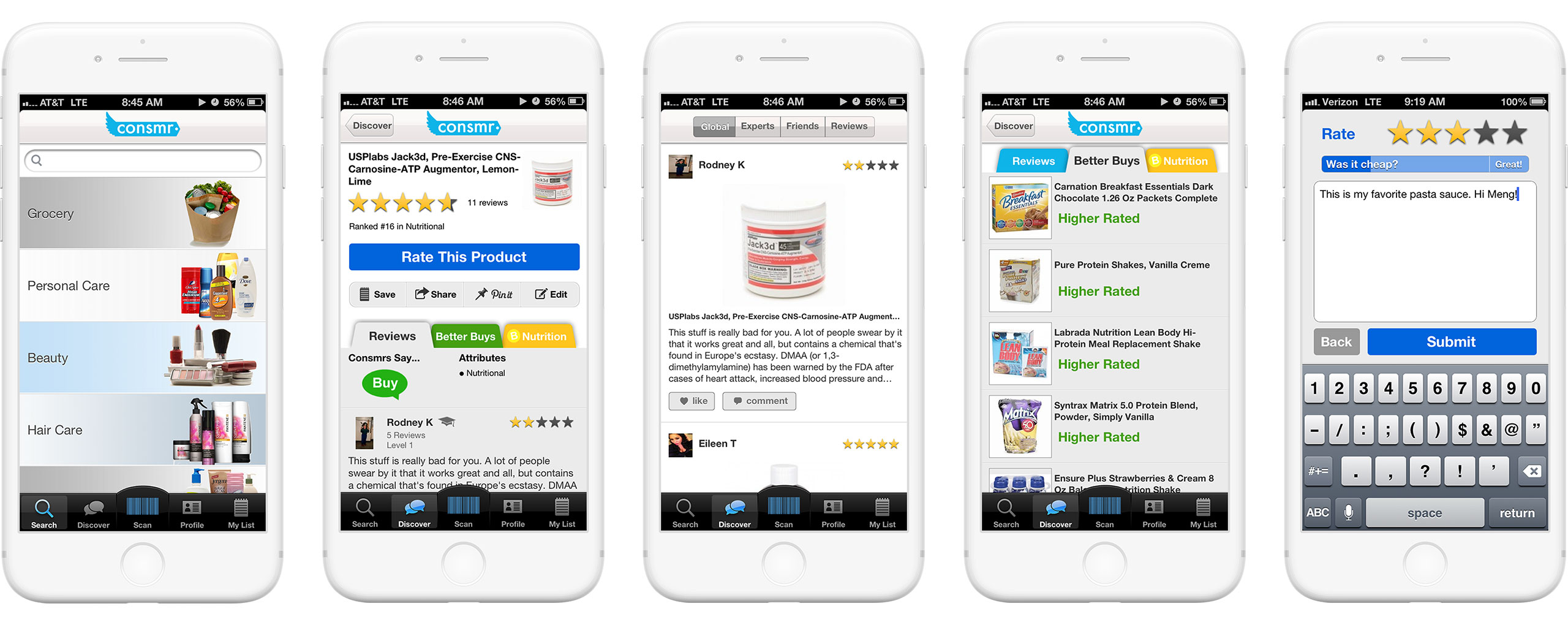
The original Consmr app screenshots from 2012.
RYAN'S WIREFRAMES
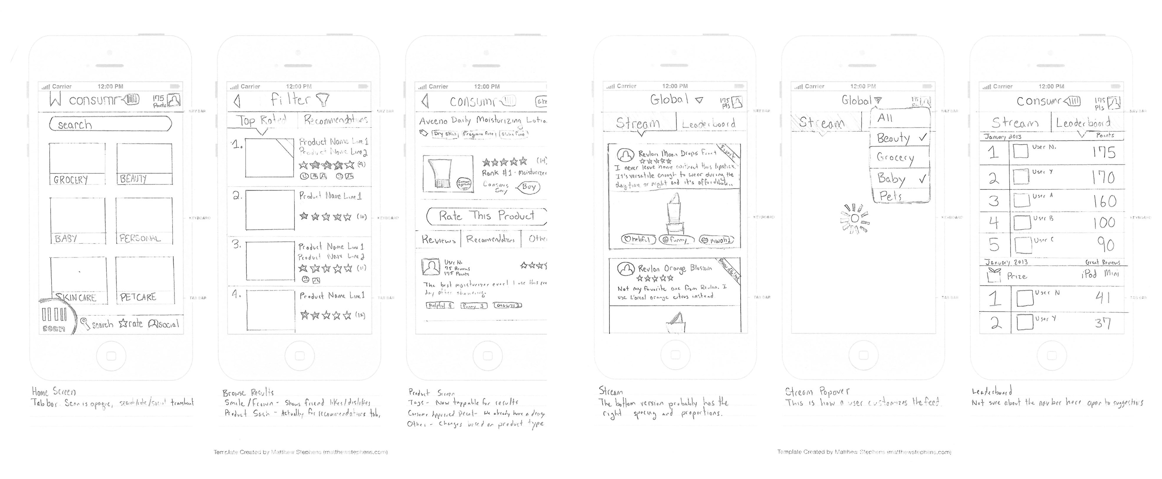
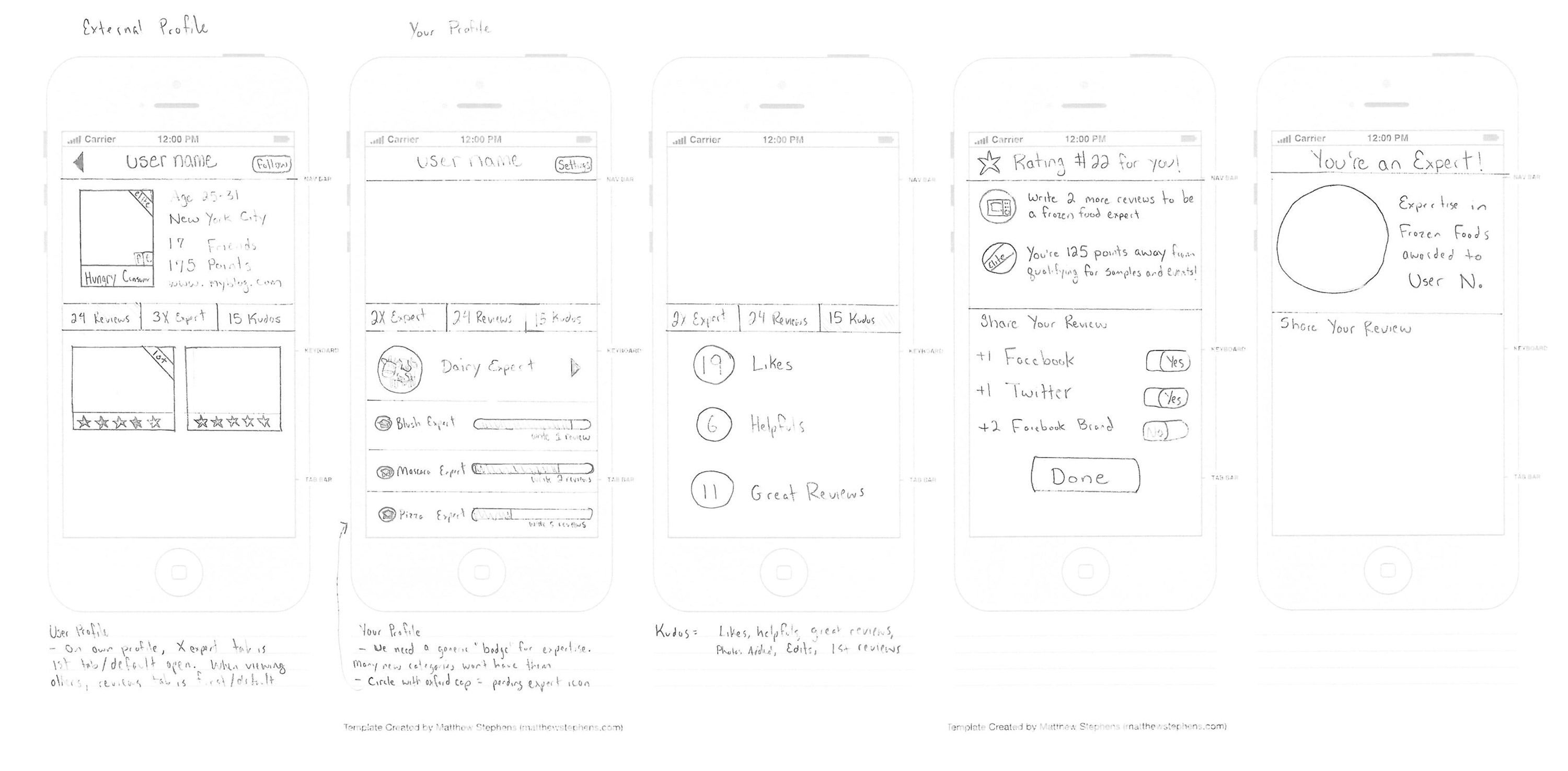
Ryan knows product. And not just product, generally. But when you're as close to the users of his app like he is, you understand the nuances that an outsider like me would miss.
Physical UX: There's a reason the scan button is on the bottom left, and huge. When you're holding a product with one hand, and looking up reviews with the other, it needs to be an entirely one-handed experience. Invoking the 80/20 rule, we'll cater to the primarily right-handed audience, holding the phone in your right hand, where your thumb would more-easily and naturally reach the bottom left than bottom right or center (quick reminder: this was the pre-phablet era).
Psychological UX: Don't just slap a leaderboard on it. There's nothing more demoralizing than reaching the end of Ms Pacman at Barcade, only to see that all 10 of the high scores are six digits long. On Consumr, there's encouraging feedback architected into the product's DNA to encourage achievable milestones and constantly placing you in smaller contexts to allow for positive feedback that would be lost globally.
Nudging UX: Writing original content is hard! Especially when you're staring at a blank screen—it takes every ounce of my willpower to resist writer's block when I start a new Word document. When someone begins to write a review, Ryan added inspiring prompts and a progress bar to encourage longer and higher-quality reviews. "Was it cheap?" "Would you buy again?" "Great review!"
INITIAL DESIGN EXPLORATIONS
During the time of this redesign, the early adopter userbase was primarily women, and likely savvy suburban moms. As Consumr pushes outside this initial audience with which it clearly struck a chord, Ryan wanted the design to appeal to other demographics while not alienating its core.
A few specific design challenges:
1 Gamification is at the core of the product. Every interaction felt satisfying. Writing reviews was fun and rewarding. Giving kudos kept the community positive and engaged. Everything was fun.
2 There's a ton of information for each product that different people may focus on and act on. For some people, it's the final Consumr rating: buy or skip. For others, it's the ratings.
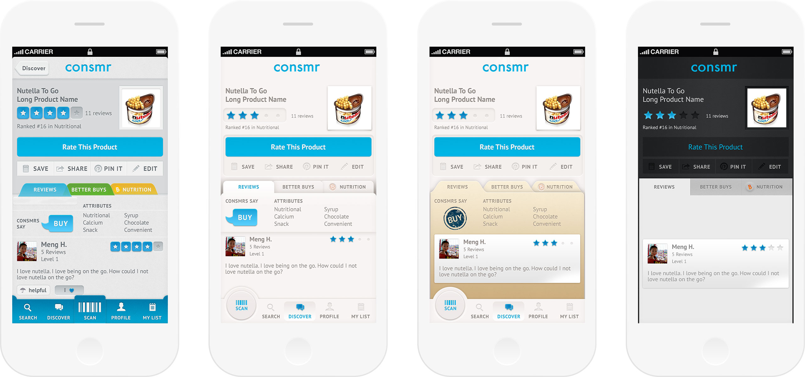
I clearly went off the deep end on the skeuomorphic trend. Inspired by the original design, folders looked literally like tab folders. It brought me back to the color tabs I'd peel and stick in my 8th grade binder checks for honors credit. I got carried away shading the sticky clear area with a hint of glue, and shading the crisp die-cut edges of the manila folders. These are a coding/scaling nightmare and doesn't begin to address the redesign goals. Survey says, zero people associate fun with manila or tabbed folders. The added shading felt fussy, and the trade-off of subtle details made key features difficult to read at a glance (especially if it's used for its intended purpose at the grocery store aisle). Plus, the majority of major apps at the time were skeuomorphic for some extent—using dropshadows to carve out affordances on a flat, digital screen. A 1px inset shadow to create a highlight and a dark dropshadow below gives enough of a heuristic hint that the button is pushable.
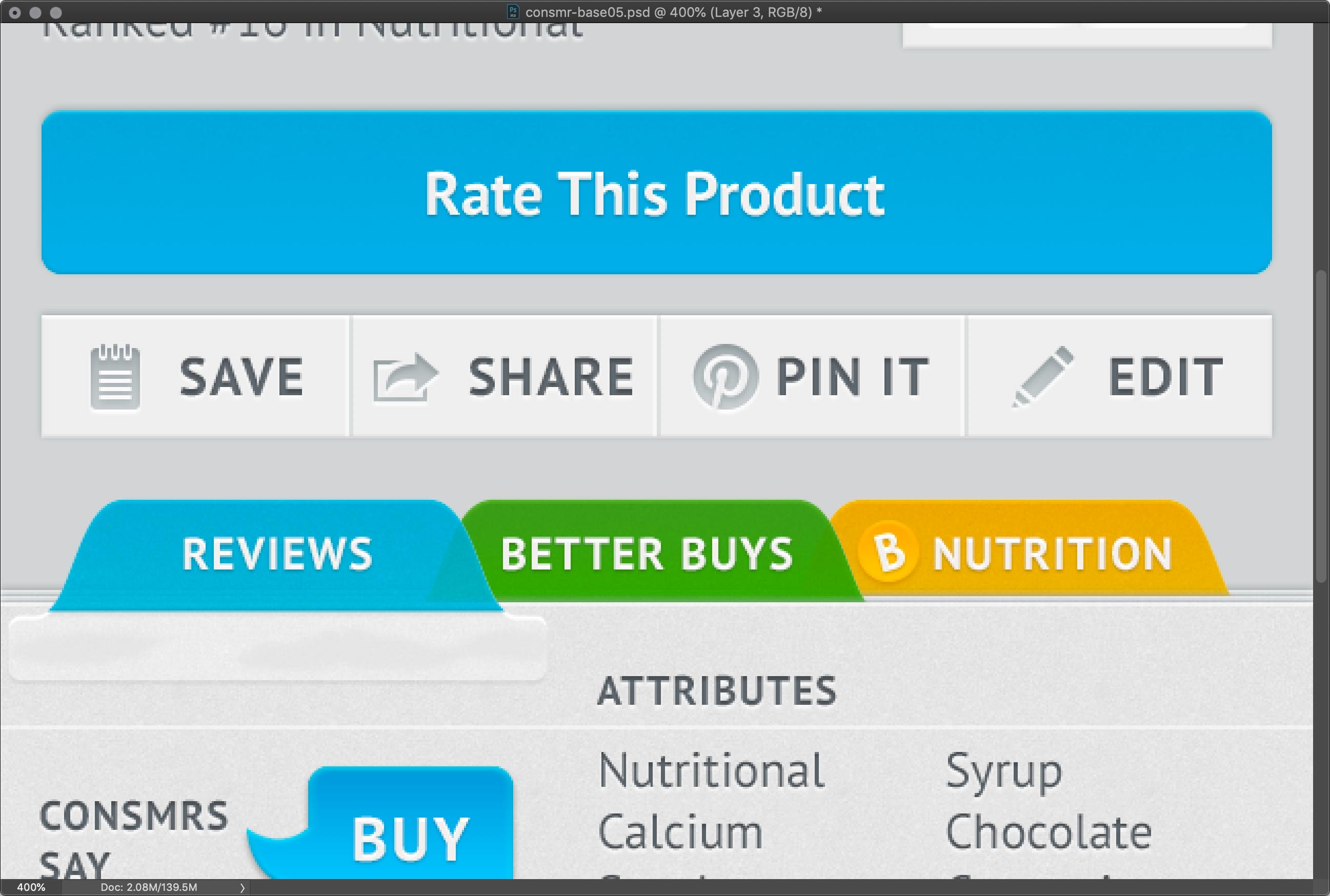
What happens when I get a little...okay, a lot...carried away with the details.
FINAL SHIPPED DESIGN
Heading into the final direction, design got out of the way. I didn't have the shade the living daylights out of every layer until the file complexity crashes my computer (these were the pre-Sketch days with Photoshop files and layer comps if I was extra-diligent about organization). We returned to the strong bones of this product and let the features and interactions breathe.
Buttons didn't need to be shaded to give it a touchable affordance. without all the visual complexity from textures and shading, the blocky buttons stood out in higher contrast as tappable tiles. The clusters of information became more modularized and appeared less cluttered with less ornamentation. Breaking away from the realism trend and leaning toward a minimalist, modern look is our bet on reaching also the younger audience while not being so edgy as to shock existing users.
WELCOME FLOW
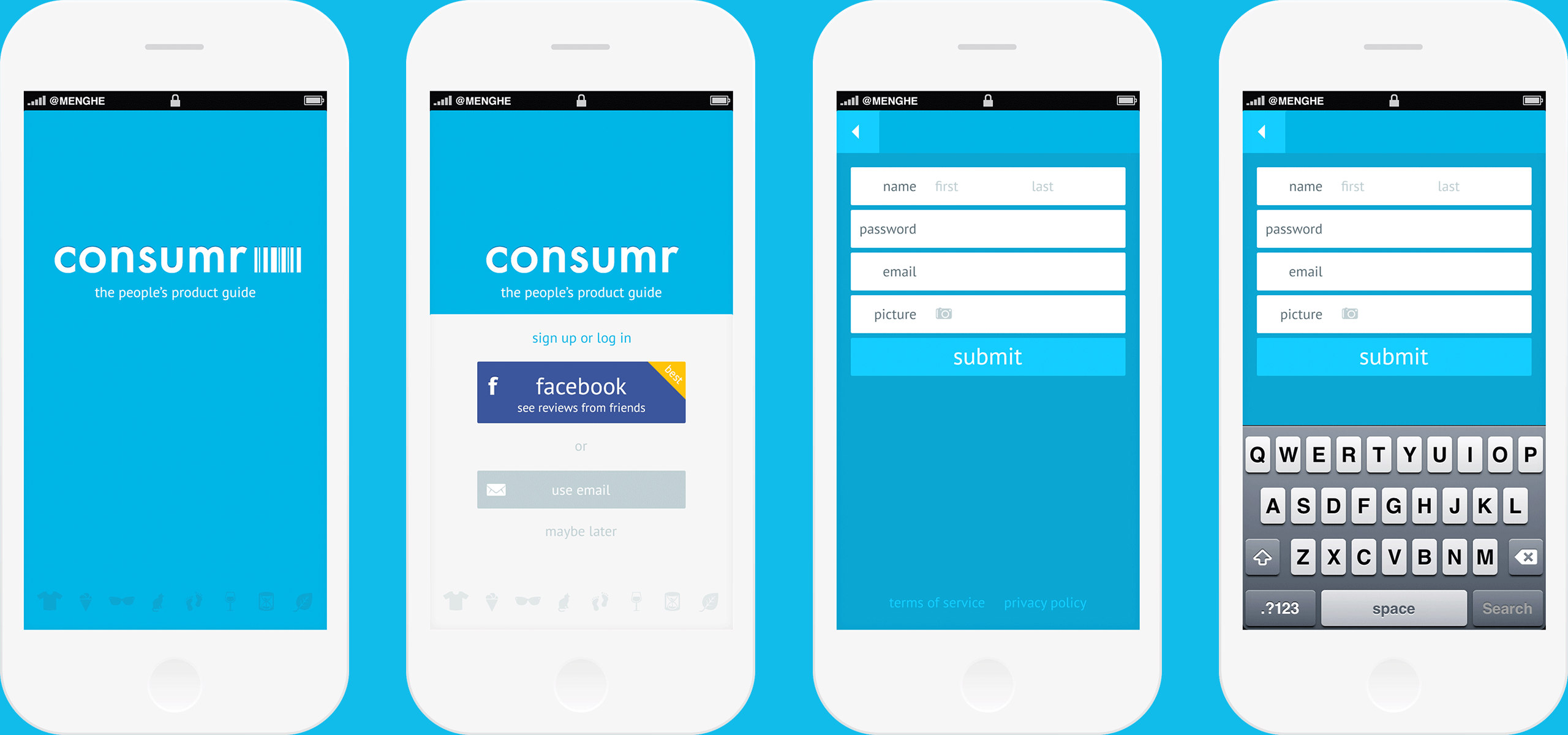
First time flow: a carousel of icons scrolling across the screen to give the new consumr a hint at the product categories.
Reserving yellow for "juicy" interactions and positive feedback, the Facebook sign up button gets a little gold corner.
Reserving yellow for "juicy" interactions and positive feedback, the Facebook sign up button gets a little gold corner.
Per Ryan's wireframes, even if you choose to go the long way of manual sign up, it's still a simple form...
...so that all the required fields are still visible when the keyboard comes up on tap.
CORE FUNCTIONALITY: FIND OR DISCOVER PRODUCTS
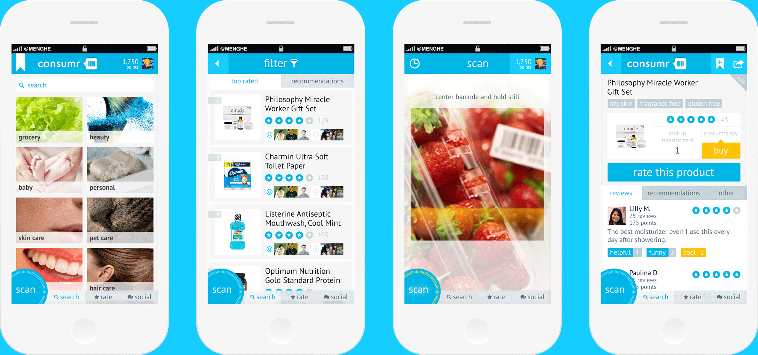
Browse by category or search for your product. Picking the right photos here is tricky, but key. One way to transform photos that might look too out-of-the-box "stock" is zooming in and cropping at the visual element that makes the photo look distinctly representative of the category.
Though this looks far more chic for the Consumr brand than traditional-looking category images (especially for mock-up purposes here), it would be worth A/B testing the overall effect of these more artsy photos.
Do more people turn to search because it's harder to quickly size up where their product might hide under a category tile? Do people tap back and forth more because they land on the wrong category? Do product detail page views decline? Do overall usage stats decline? What about variant tests of different close-up cropped photos, in case it's the photo itself, and not a problem with the concept? Or a variant test of an icon instead of photos to represent categories?
In the aisle? Tap that corner to scan it and be done in two seconds flat.
Product detail screen with need-to-know product summary on the top half, with reviews, recommendations, and more below.
WRITE A REVIEW
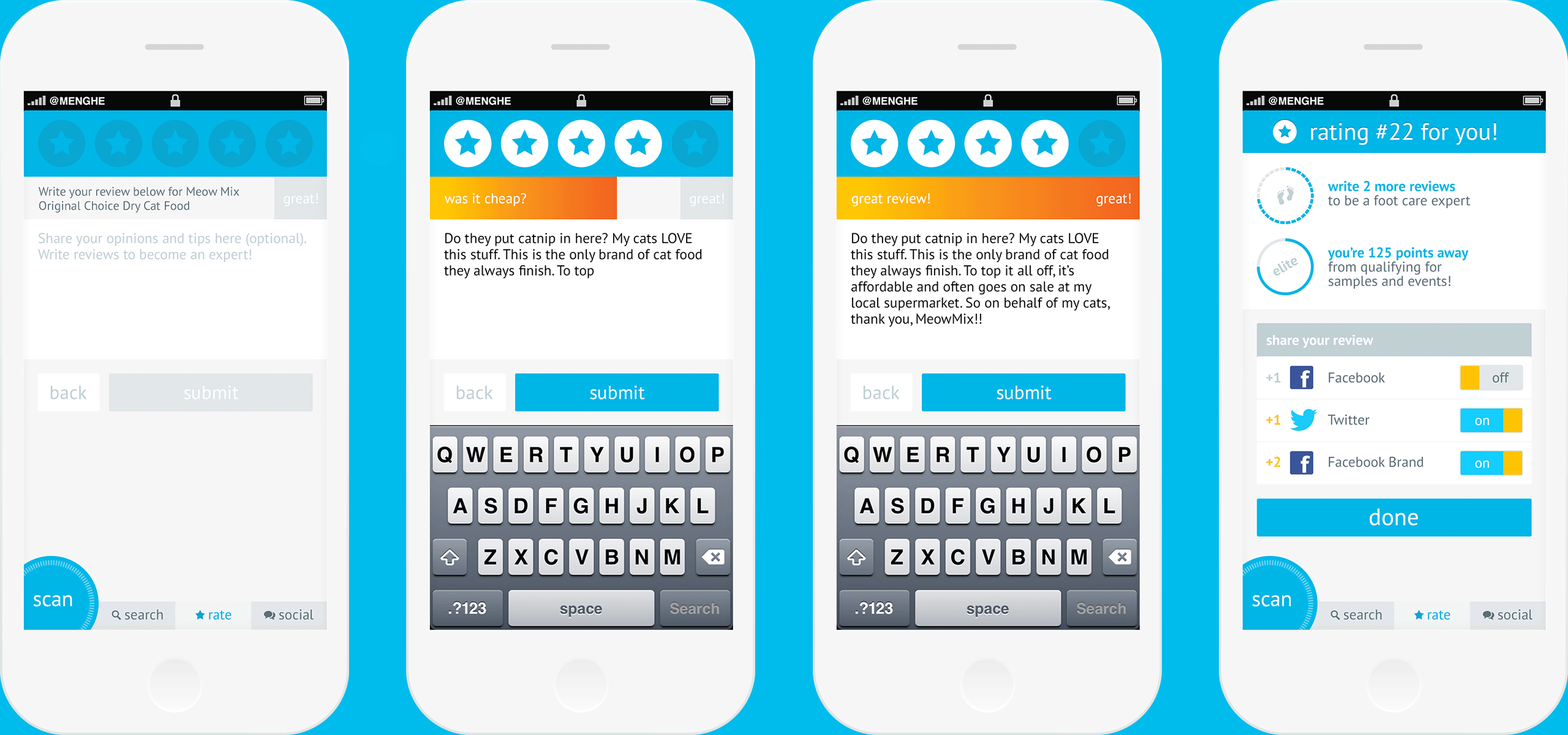
To contribute and be helpful on Consumr, the only thing required is to give the product a rating from 1–5 stars. Super easy, light-touch, non-confrontational. Writing the review, a bigger ask, is secondary to the blue star rating strip.
Writing original content is hard! Especially when you're staring at a blank screen. When someone begins to write a review, Ryan added inspiring prompts and a progress bar to encourage longer and higher-quality reviews that hits all the points a curious consumer might need to know. "Was it cheap?" "Would you buy again?" And when you've hit all the criteria: "Great review!"
YAY instant feedback for your hard work! You're so close to the next expert badge—maybe just the push you need to keep that momentum going and write that next review?
QUICK RATE
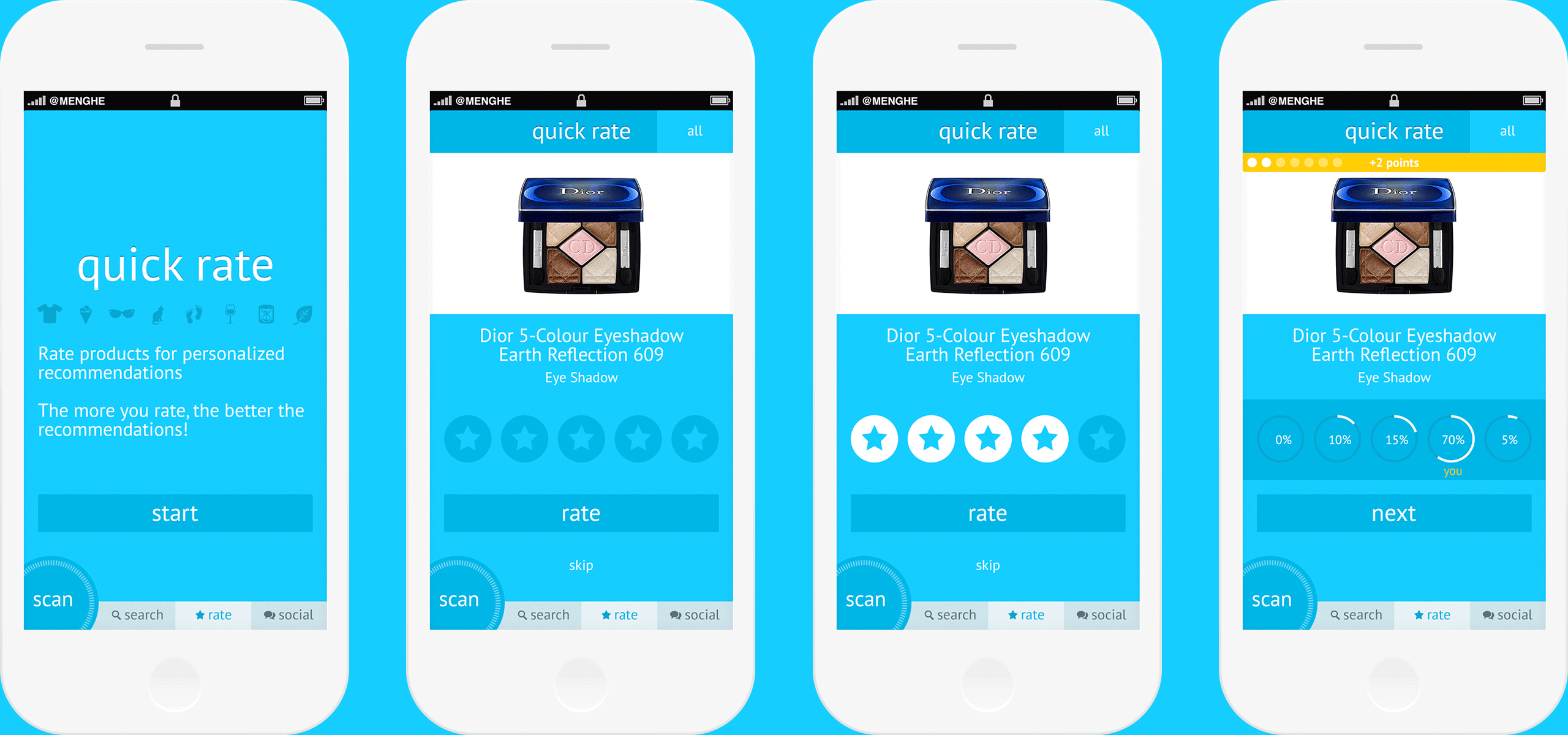
The more ratings, the more useful the ecosystem. Not everyone has the time nor interest to invest in writing full reviews, but Consumr can still capture quick insights that feels like a light and fun minigame.
Another option to make this process feel even quicker would be to remove the "rate" button and save the rating after tapping the star rating. Pre-launch, it's unclear how certain people would be in their ratings. Post-launch, this would be an interesting area to revisit once data rolls in that gives an aggregate sense of how often people change ratings. Or, a feature to A/B test (hypothesis: making quick rate one tap increases number of products rated per quick rate usage session).
After your rating is saved, Ryan's instant feedback feeds your curiosity (how did I compare with everyone else?) and reward coffers (+2 points).
PROFILE & SETTINGS
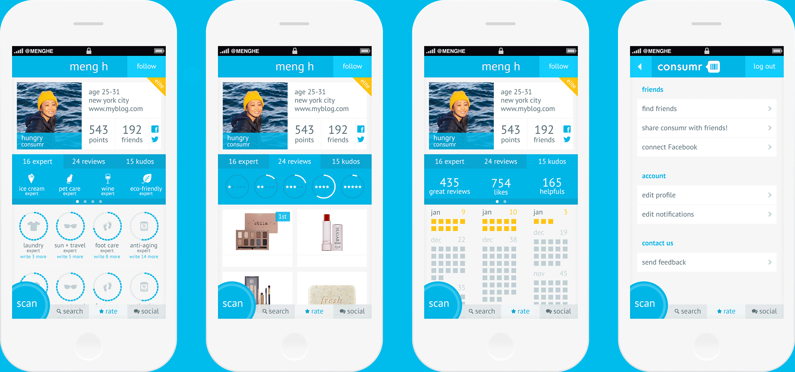
Viewing someone's profile gives you a snapshot of their personality. I'm obviously a hungry consumr with elite expertise in ice cream (pet care expert is aspirational). Below, see how close you are to closing those rings and earning expertise in more areas—perhaps you have time to drop some knowledge can let that inner foot care expert shine.
See the history of products you've reviewed and check if you have a particular penchant for any particular rating. [Having worked with Shindig on simplifying ratings to a binary like/dislike, studies on rating systems and collective choice is fascinating to me.]
See the history of products you've reviewed and check if you have a particular penchant for any particular rating. [Having worked with Shindig on simplifying ratings to a binary like/dislike, studies on rating systems and collective choice is fascinating to me.]
The view shows an infographic-like breakdown of kudos received. In hindsight, I wish I more clearly carved out the lanes so that the cubes below are more closely related to the headline on top (especially with the swipe pagination dots adding an extra barrier to that association).
And the good old settings to set a visual standard for utility screens.
FRIENDS & COMMUNITY
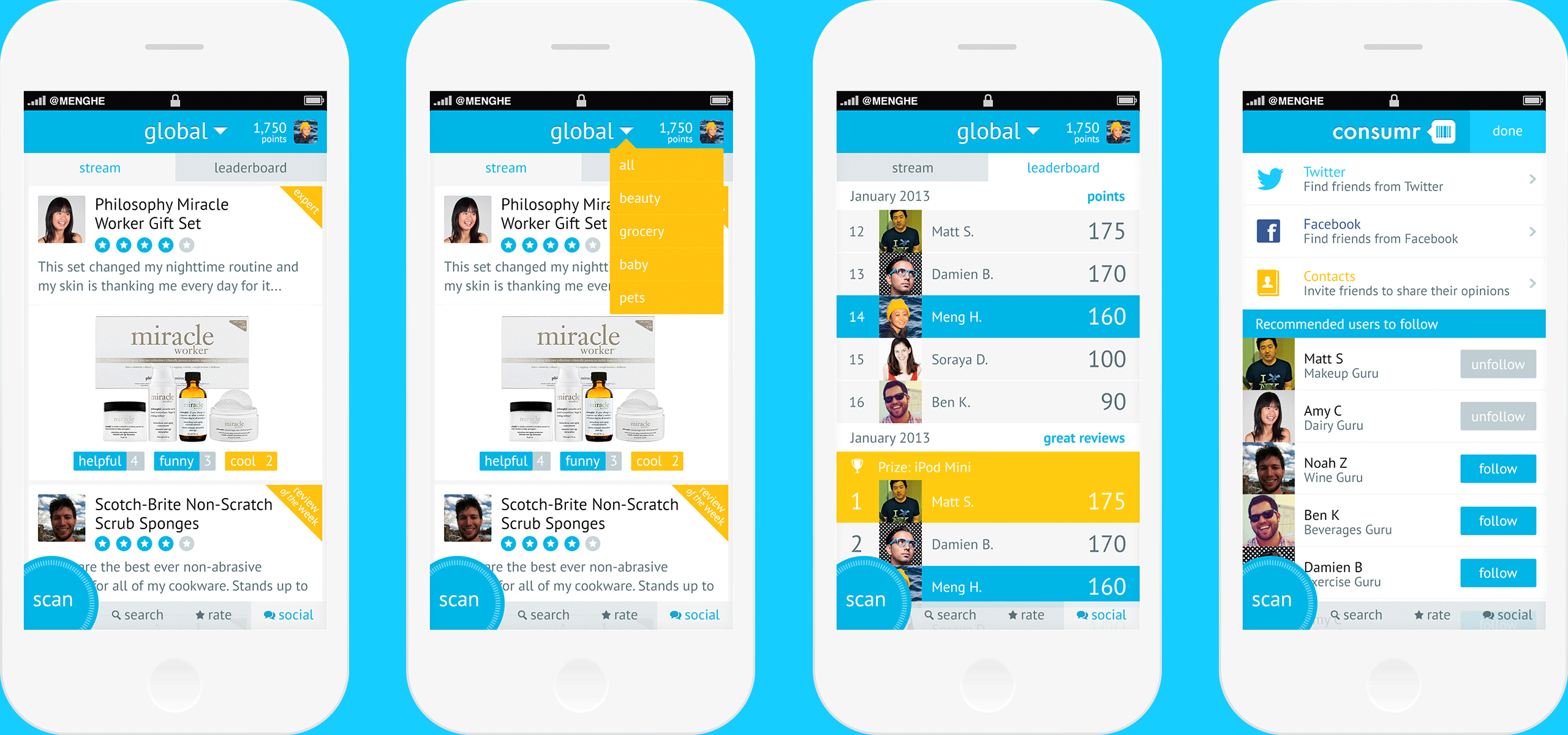
You've seen above how you can browse products categorically, search for them, or scan their barcode. For reviews,
Another option to make this process feel even quicker would be to remove the "rate" button and save the rating after tapping the star rating. Pre-launch, it's unclear how certain people would be in their ratings. Post-launch, this would be an interesting area to revisit once data rolls in that gives an aggregate sense of how often people change ratings. Or, a feature to A/B test (hypothesis: making quick rate one tap increases number of products rated per quick rate usage session).
The other side of the social coin is the leaderboard. In addition to the intrinsic motivation of helping others find their next favorite dish soap, these leaderboards add a dose of extrinsic rewards. Ryan's concept is that each month, the top reviewer (by each type of measurement: points, kudos, etc.) could win a prize. Resetting the leaderboard every month gives everyone hope of participating, even if you're new, and incentivizes the veterans to continue contributing quality content. On load, you see yourself centered on each leaderboard, so you can see your position in relation to others in an achievable position and in the broader context—even if you're #5,623, you're only 3 points away from dethroning #5,522.
Accessible through Settings, link your social accounts to find friends. Follow becomes a lower-contrast gray unfollow—there if you changed your mind or need to undo a tap.
WRAP UP
It's incredibly exciting to see your work launch and even get screenshotted in the press. Consumr was acquired by Purch in 2015, and rebranded/redesigned in that process.
CREDITS
UX/UI and wireframing: Ryan Charles
Art direction: Ryan Charles
Visual design and app icon: Meng He
